Thursday, June 07, 2007

Women in art


Follow this link to a very trippy, beautiful video made by morphing between portraits of women going back to the Middle Ages.

Thanks to Al Gordon for the link.

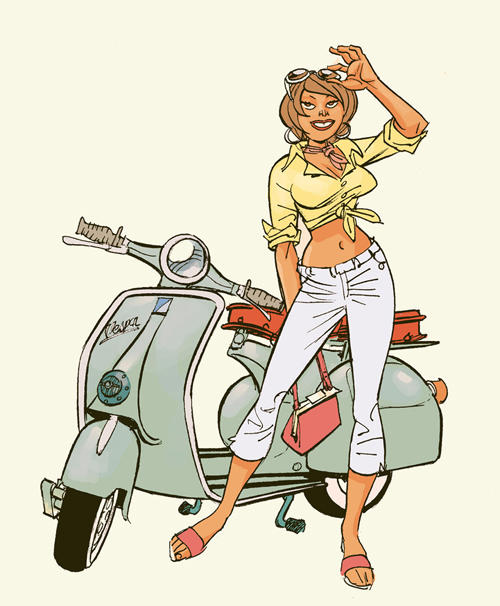
I did something much less ambitious but similar a while ago when I was trying out a demo version of a morphing program. Recognize the beauty with the ghostly teeth in the illo at left? "She" is a morph between Adriana Lima and Salma Hayek, than whom Nature has provided no greater known exemplar of feminine beauty, IMHO. Click below to see this as a very short movie. I'm not sure how much educational value this has, so please don't watch it more than 7 or 8 times.


JH

Tuesday, June 05, 2007

That's MISTER Doctor Wizard, if you don't mind.


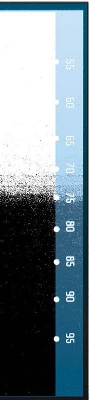
So I got all scientific this morning on the question of what constitutes non-photo blue. I decided to find out how dark a blue I could print out for inking over. I printed a "bluescale" on a slightly grubby piece of bristol and scanned it as lineart/bitmap to see what was the highest concentration of blue I could have on a page without risking it scanning as black. The grainy black in the image is the bluescale turned into a bitmap. As you see, the answer is: a little over 60% cyan is the darkest blue you should print on the page. The more purely cyan the blue is, the better, except a little bit of yellow doesn't hurt. A little bit of black naturally would present a problem--too likely to scan as dirt.

So from now on when I convert a grayscale scan of pencils into blue for inking, I use Photoshop to convert it to CMYK, then select Image> Adjustments> Hue/Saturation. In that dialog box, check the box called "Colorize." Then set the Hue to 178-180, Saturation to 100. If you leave the Info palette on top, you get a continuous readout of the concentration of colors where your cursor is, even when you are in the Hue/Sat dialog. Just put the Lightness slider to where the darkest area in your art is a little over 60% cyan. Then hit OK and git ta printin'.

(Don't forget: always scan your inked art as lineart/bitmap, with a high resolution: 800ppi or more.)

It's the optimum combo of "readability" and scannability!! You'll thank me in your heart. It's really helped me in inking Tony Talbert's incredible pages on this pitch we're doing. If you're real nice, I'll show you one of these times!

JH

P.S.: Read DRAW! Magazine Editor Mike's alternate method in the comment below. Thanks, Mike)

Sring Show, Lollipops and Rainbows


A shockingly upbeat roundup of recent newbits:

I hope you all get to visit the Spring Show (on through the third week of June), which is housed for the first time in a single building. It's at 601 Brannan at Sixth, in a slick Academy Building with an atrium. On the ceiling of the atrium is a meandering track and a little mini-crane that runs along it-- a vestige, presumably, of whatever function the place formerly had.

Tyliea's, Celeste's and Rahsan's work all made the cut. On the opening night, Department's Director Chuck gave his remarks, announcing the awards. Our guy Rahsan won second prize in the Comics category. Chuck mentioned proudly that Rahsan was already working. The word "superstar" may have been used. First prize went to a talented guy in Dan Cooney's class, Ron Anderson, though I of course felt it should have gone to Rahsan. The painted cover of Celeste's book-in-progress book was on exhibit too, huge and great-looking.

The Illustration Department as a whole came off wonderfully again.

*********
My buddy Eric, who was one of the judges, recently showed me a booklet of Student Contest winners from the Society of illustrators. I saw a lot of work I recognized -- because it was from Academy students! The Academy appeared to me to be more represented than any other single school, including Pratt, Parsons, and SVA.

*********

I went to Super-Con in San Jose this weekend. Former ILL193 students Tony and Corey came by to say hi. Corey won the art contest. I think I talked the talented and super-affable Mick Gray into doing an inking seminar for ILL193!

On Saturday night I went out for dinner with a big group of people including our pal Steve Leialoha and Groo writer Mark Evanier, who was an assistant to Jack Kirby long ago, and is a terrific storyteller with an encyclopedic knowledge of comics history. Mark knows everybody in showbiz and comics and has a story about most of them. I was sorry when we broke out and went back to the hotel.

Mark's blog is highly recommended: http://www.newsfromme.com Look for the mention of your dutiful teacher and a nice plug for Dan Cooney's Valentine!

JH


Next entry:
Maximizing your results when printing out pages to ink!

Friday, April 27, 2007

Pay me!


(Season of the Witch pinup by JH for creator Jai Nitz)
I've talked to you guys some about doing work on the cheap for the experience or the exposure. There are reasons for and against. Number one for probably is that printed work is more impressive than sample pages, and so helps the hunt for paying work. And number two might be that you learn more by doing real work than by doing samples. The linked text piece, forwarded us by Illustration Department instructor Cameron Wasson, makes very strongly the case against.
http://positionrelative.wordpress.com/2007/01/23/craigs-pissed/
The unhappy fact is that almost everybody gets screwed over at least once. I think the trick is to try to manage it so your eyes are open, you're doing it for a reason and it only happens once. A whole lot of artists, myself included, are poor self-promoters and poor businessmen. If you recognize and believe in the value and rarity of what you do, as this piece counsels, you might be on your way to being that rare artist who knows his or her own worth.

JH

Arty Imitates Art


As we comic book artists struggle earnestly to bring observations about real life into our art, those smarty-pants fine artistes are stealing ideas and devices from comics!
Art Review | 'Comic Abstraction': Visions That Flaunt Cartoon Pedigrees

Thanks to Chuck for the link.
JH

Wednesday, April 25, 2007

Project Pickup

You who gave me pages to print can pick up your pages and printouts at the ILL dept office. They are kept in my mailbox, and grouped under your name. Just go the window and ask one of the work study students to grab it. I scanned all the pages you gave me but, for time's sake, only printed the first two or three this week. All your origs are waiting for you in the mailbox.

Warm up and have fun! Keep the original page close at hand so you refer to it for fine details. Think about inking a page then scanning and flatting it for the lab day (see preceding entry, below)! Then you can see if you have time left to ink a second page.

JH

Tuesday, April 24, 2007

Photoshop Phun

Hey, Ya'll,
Here's whatcha do to get the most out of next week's lab, which will be held in our usual building.
Save this:
http://www.Heebink.com/ILL193/Photoshop-Primer.wps
OR, if your computer doesn't have the Windows word processor or something more versatile, open this
http://www.Heebink.com/ILL193/Photoshop-Primer.txt
and copy it into the word program of your choice so the lines wrap. Read it, at least through Part 2, if you can possibly find the time.
Then download these two files
http://www.Heebink.com/ILL193/channels-CMYK.sit
http://www.Heebink.com/ILL193/layers-RGB.sit
OR, if you don't have the Stuffit expander, download the slightly larger unStuffed .psd's
http://www.Heebink.com/ILL193/channels-CMYK.psd
http://www.Heebink.com/ILL193/layers-RGB.psd

These files represent the two main ways you can set up a coloring file. Take a look and compare them. If you're scanning in your own art, you should follow the example of one or the other, based on what you decide after reading the Primer. You shouldn't change the mode (RGB, e.g.) or the size of a file after you've flatted it, so it pays to pick a plan and stick with it. The Layers method is easier, and slightly more intuitive. Makes a bigger file though, and can give you a shock when you--well, read the Primer. It defines flatting too, which is not to confused with the merging of all layers near the end of a job. That's called flattening.

Note that in the Channels file, you'll need to go to the Channels palette and click open the eyeball of the Alpha 1 channel, where the line art lives, in order to see it. Don't highlight that channel, you won't be able to work on the color. The CMYK channel must be hi-lit.

These are the files you'll be working on in the lab, unless you provide your own, and I will be grading you on what you produce, so that the whole day doesn't turn into a pointless jagfest. Trust me, it's happened.

I very strongly recommend you get your file flatted (with at least the randomly assigned colors--see Primer), so that what you do in lab will be productive and fun. We'll be critiquing but not grading the inking next week, so it'd be wise to trade away a chunk of inking time to get your coloring file squared away. (BTW, the files above are flatted already.)

We'll meet in our usual room. See you there.

JH

Tuesday, March 13, 2007

Tan, Exhausted, and Unready


(Art by Adam Hughes)
I just discovered that the schedule has an inconsistency in it. Rather than go back and sneakily edit "Because You Demanded It..." (2/16/07), I thought I'd bring it to your attention with this new entry. The trouble was that the schedule had us reviewing four pages pp. after only having drawn three. So a new, closely edited schedule appears below.

Let us agree that we (by which I mean you) will return from spring break with three penciled pages. Most of you are pretty close to or ahead of that pace. But this does include revised pages--please show us that you have taken to heart the trenchant yet caring commentary of your fellow students and mine, and made changes to maximize the effect of your pages. No ego-driven coddling of your precious darlings por favor; put the horrid little bastards on a treadmill till they're lean, mean and gleaming. And I mean three penciled pages. If you've jumped ahead and gone to inks on any pages, please provide a xerox or print of those pages as penciled or get yourself busy on making a new penciled page. I'm adamant on this point; I made it clear you were to have pencils and inks to show for yourself at the end of the semester.

Here's the schedule for the rest of the semester, revised.

Meeting 8 (Tuesday27Mar) Midterm Quiz (see details below). Review first 3 pages of pencils. Assign next two pages of pencils (through p. 5), changes to p. 3.

Meeting 9 (Tuesday3Apr) Review next two page of pencils (through p. 5). Assign final page of pencils. Make 100% Xeroxes or PS Scans of all pencils for inclusion in final pitch packet -- BEFORE ANY INKING!! Reminder to bring inking kit and xeroxes of pencils to next class. Then INKING LAB 2. In-class inking exercises.

Meeting 10 (Tuesday10Apr) Final Review of pencils. Bring xeroxes or email jpegs to John. Assign penciling of character sketches, three cover layouts. Catch up for coming benchmark. VIZ TOUR???????????????

Meeting 11 (Tuesday17Apr) Review of character sketches, cover layouts. Final tweaks on pencils in class! New xeroxes as needed. Benchmark: all pencils finished, corrected! Assign cover pencils, optional inking of character sketches.

Meeting 12 (Tuesday24Apr) Review of cover pencils. INKING LAB 3? In-class assignment: inking of provided panels? Assign two pages of inking, plus (optional) getting one's own files ready for upcoming Photoshop lab.

Meeting 13 (Tuesday1May) Review of first two pages of inking. Assign next two pages inking, (through page 4), PHOTOSHOP LAB DAY

Meeting 14 (Tuesday8May) Review of next two pages of inking (through p. 4). Assign last two pages of inking, plus possibly cover inks. Reminder to touch up smears, erase margins, etc. Remind of possible potluck Banquet of Snacks.

Meeting 15 (Tuesday15May) Presentation of Final projects. Turn in Xeroxes of same, including copies of pencils, to John. ALL-POSITIVE COMMENTS DAY. Discussion of approaching publishers, professional conduct, further schooling, written part of pitches career benefits of storytelling skills. Potluck snack banquet? GUEST REVIEWER Chuck Pyle

So... the Midterm quiz: please review this list of terms from the blog of Week Two. You should be able to explain or provide an example of each.


  • "Drawing Through
  • ""Even if you can't see it, it still shows"
  • Contrapposto
  • Canon(s) of proportions
  • Line of action
  • Atmospheric perspective
  • 2-point perspective
  • 3-point perspective always involves either the...
  • zenith or the..
  • nadir

  • Establishing shot
  • Close-up
  • Extreme close-up
  • Medium shot
  • Two-shot
  • Three-shot
  • Dutch angle ("camera" is tilted)
  • 180 rule
  • Prop continuity
  • "Variety and Unity"
  • "breathing room" and its close cousin, open areas (white paper)
  • Eye-path
  • Shape schemes, ala Frazetta's triangles
  • FG-MG-BG
  • Dynamism
  • Storytelling

Have a wonderful Spring Break!

JH

Tuesday, February 27, 2007

Pages to Ink, for Practice


Today I am reposting a small gallery of pages I have scanned in and converted to light-blue .psd's (Photoshop files). If you would like me to print out any of these for you to practice inking on, give me a list of the ones you would like printed and a dollar for each. (I'm about to have a working printer again.) The next class meeting I will bring you back a printout out on 11" x 17" bristol board. I highly recommend you download and print out the black-and-white jpeg that opens when you click on the thumbnails in the gallery. Then you can have that to refer to as you work. The jpeg will scale to print out at 8 1/2 x 11" at a nice high resolution. (I have not linked to, or even uploaded, the bluelines to my site, as none of you have 11 x 17" printers.)

Gallery of Pages for Inking Practice

In a disgraceful display of artistic narcissism, I have led off with a tightly penciled Elvira page of my own, and -- worse -- stacked the deck with more challenging (better, but less finished) pages, albeit without planning to. This may have the effect of channeling you toward whetting your inking teeth on my sterling contribution before perhaps moving on to the golden glories of, say, the great John Romita, Jr.

JH


P.S.: Once you've downloaded the jpegs, you can right-click on the file icon and select "Properties" to view the artist credits and my notes on what challenges each page holds. Apologies for the slow downloads.

Thursday, February 15, 2007

Jeep Patriot Comics


Here is the rare use of comics in advertising that doesn't use comics as a mere motif. Instead of the usual nostalgic Pow-Biff sound effects and big color dots, the people at Jeep actually made a comic that reflects the way comics look now. Then they built a racy Flash interface around it and invited our participation in determining where the story goes from here. Note that you can even view the pages in their penciled and inked-but-uncolored forms.

It's remarkable that Jeep presumes there are a lot of potential customers who are not just receptive to comics as a medium but interested in its creative process. The brave Comments and Submissions counters will tell the tale. It goes to show, not only the rising cultural currency of comics, but also your potential for landing similar gigs when you leave the good ol' Acad. As a rule, advertisers pay a lot better for comic-book art than comics publishers do, you know.

https://www.patriotadventure.com/

Thanks to Chuck for the link.

JH

Tuesday, February 13, 2007

Because You Demanded It...


..Another list, of a sort. Here's our schedule for the rest of the semester. Uncertainty as to actual date is signaled by question marks, e.g., on such items as Guest Speaker Day!
This week's illustration is by the late, great Wallace Wood, ghosting Will Eisner in The Spirit Section, a 20-pp. comic-book insert for Sunday newspapers in the '40s and '50s.


SYLLABUS/schedule
Meeting 3 (today) Review "Vegas" penciled page. Assignment: thumbnail and lay out first 3 layouts. clean--With indications of centerlines on major forms, backgrounds and perspective. Happy Valentine’s Day!

Meeting 4 (Tuesday20Feb) Review layouts in relation to variety, unity, eye-path, diagonals, breathing room, shape schemes, depth, storytelling, perspective. Assignment: final three thumbnails and layouts, changes to first four.

Meeting 5 (Tuesday27Feb) Review last three page layouts. Troubleshoot as necessary. Discuss perspective, working method, materials. Assign changes to last three layouts, and first page of pencils.

Meeting 6 (Tuesday6Mar) Review first penciled page. Benchmark: All layouts done. Discuss use of black, line weight. Assign next page of pencils, changes to p.1.

Meeting 7 (Tuesday13Mar) Review pp. 2 revised p. 1. Assign pp. 3 of pencils, changes to pp.2, study for midterm quiz. Happy Spring Break!

(Spring Break)

Meeting 8 (Tuesday27Mar) Midterm Quiz. Review first 4 pages of pencils. Assign next page of pencils (through p.4), changes to p. 3. GUEST SPEAKER DAY???

Meeting 9 (Tuesday3Apr) Review of next page of pencils (through p. 5). Assign final page of pencils. Make 100% Xeroxes or PS Scans of all pencils for inclusion in final pitch packet -- BEFORE ANY INKING!! Reminder to bring inking kit and xeroxes of pencils to next class. Then INKING LAB 1. In-class inking exercises.

Meeting 10 (Tuesday10Apr) Final Review of pencils. Bring xeroxes or email jpegs to John. Assign penciling of character sketches, three cover layouts. Catch up for coming benchmark. VIZ TOUR????

Meeting 11 (Tuesday17Apr) Review of character sketches, cover layouts. Final tweaks on pencils in class! New xeroxes as needed. Benchmark: all pencils finished, corrected! Assign cover pencils, optional inking of character sketches.

Meeting 12 (Tuesday24Apr) Review of cover pencils. INKING LAB 2? In-class assignment: inking of provided panels? Assign two pages of inking, plus (optional) getting one's own files ready for upcoming Photoshop lab.

Meeting 13 (Tuesday1May) Review of first two pages of inking. Assign next two pages inking, (through page 4), PHOTOSHOP LAB DAY

Meeting 14 (Tuesday8May) Review of next two pages of inking (through p.4). Assign last two pages of inking, plus possibly cover inks. Reminder to touch up smears, erase margins, etc. Remind of possible potluck Banquet of Snacks.

Meeting 15 (Tuesday15May) Presentation of Final projects. Turn in Xeroxes of same, including copies of pencils, to John. ALL-POSITIVE COMMENTS DAY. Discussion of approaching publishers, professional conduct, further schooling, written part of pitches career benefits of storytelling skills. Potluck snack banquet? GUEST REVIEWER Chuck Pyle

Tuesday, February 06, 2007

For Love of Lists


SECOND WEEK
Reminders:
Free admission to SFMOMA for AAU students;
Spring Show; 540 showcases;
Illustration Town Hall Meeting, 3pm. Thu. 8Feb, 540 Powell. Air your hopes and gripes!

Summary of voting:
Yes to covering Photoshop coloring, Yes to lettering.
No to live model, Cartoon Art Museum.

Hey, y'all...
Here are the key concepts and terms we reviewed in class today!
...And if you're not going to do your own pet project for the pitch that makes up the bulk of this semester's work, then check your options in the "Pitch Basket" below. Yet another option is doing a retro script on an existing comic--working with popular existing characters, in other words. Up to you. Next week is decision time!
"Drawing Through"
"Even if you can't see it, it still shows"
Contrapposto
Canon(s) of proportions
Line of action
Atmospheric perspective
2-point perspective
3-point perspective always involves either the...
zenith or the..
nadir
Establishing shot
Close-up
Extreme close-up
Medium shot
Two-shot
Three-shot
Dutch angle ("camera" is tilted)
180 rule
Prop continuity
"Variety and Unity"
"breathing room" and its close cousin, open areas (white paper)
Eye-path
Shape schemes, ala Frazetta's triangles
FG-MG-BG
Balance: black=weight
Dynamism
Storytelling

Pitch Basket: Alternatives to doing your own idea. Here are the different pitches I've assembled from the writers I know. It's actually a deeper and more impressive list than I thought we were going to be able to come up with. Please be thinking of which two, if any, you would like more info on. Each one will only be assigned to one student.
Basket of ideas

Pro Art for Inking Practice: I'll be posting jpegs and .psd's of professional penciled pages for you to print out on bristol board. They will print out in non-photo blue.


BIBLIOGRAPHY ADDITIONS (Great books to have, for info and inspiration)

Writing for Comics with Peter David, 2006, Impact Publishing
ISBN-13: 978-1-58180-730-1ISBN-10: 1-58180-730-9
The DC Comics Guide to Penciling Comic Books by Klaus Janson, 2002, Watson-Guptill
ISBN 0-8230-1028-7
The DC Comics Guide to Inking Comic Books by Klaus Janson, 2003, Watson-Guptill
ISBN 0-8230-1029-5
The DC Comics Guide to Coloring and Lettering Comic Books by Mark Chiarello and Todd Klein, 2002, Watson-Guptill
ISBN 0-8230-1030-9
The Art of Comic Book Inking by Gary Martin, Dark Horse Publishing

JH

Tuesday, January 23, 2007

What's that smell?


It's a new semester abornin', teens! That means this first blog entry is filled with long lists and boilerplate, rather than my usual oh-so-stimulating and brief musings about drawing and the comics biz.

I do this blog for two main reasons:
* Providing ILL193 students a place to access information and images relevant to class
* Providing myself a forum (and you, if you care to respond) to air ideas and reactions to things going on in our field. In this, I have the help of our department head, Chuck Pyle, who sends me all manner of interesting links.

Feel free to check out past entries.

Now, however...

Link to Statement of Class Policies and Philosophy (Please read)

WEEK 1-- Policies, Materials List, Assignment and Supplemental Art!

Updated Supply list

* Pencils, of your preferred hardnesses. ALWAYS bring to class.
* Sanford Col-erase Blue or Light Blue Pencils. ALWAYS bring to class.
* Strathmore 400 or 500 Series or Utrecht 14" x 17" bristol board, smooth finish. (Trim down to 11" x 17")
* Kneaded and Pink Pearl or synthetic erasers (e.g., Staedtler-Mars White). ALWAYS bring to class.
* 30/60/90 triangle--the bigger the better. Look for one with a raised straightedge for inking
* Raphael 8404 Series Kolinsky sable brush, size #2 or #3 or #4 , (or the less expensive Escoda 1212 series, size #2 or #3 or #4) available at Pearl Paint and Jerry's Artarama. OR, alternatively, an excellent brush pen: Brush pens can be found at the Kinokuniya Stationery Store , 1581 Webster, Japantown, on the 38 Geary bus line.
* Pen nibs and holders (I'd suggest Hunt 102 and an assortment of others. I really like the Deleter nibs and holders from Japan. They are sometimes available at the Kinokuniya BOOKSTORE in Japantown, but they are a bit difficult to find because a lot of their clerks don't know they carry them. Deleter makes its own excellent holder that fits both styles of Deleter nibs, but their nibs seems to fit fine in traditional holders too.)
* Pelikan Waterproof or Speedball Super Black India Ink (Higgins Black Magic is a passable second choice.)
* Pentel Presto or Pro White or Dr. Martin's Bleedproof White or Pilot Correction pen or other correction pen
* Micron Pigma black pigment liners, sizes 03, 05 and 08, two of each
* drafting tape or dots

Optional, recommended, and ultimately indispensible:
Drawing board with parallel rule or T-square; stick-style or pencil-style eraser; architecture-style lead holder, leads and special sharpener; sanding paddle for making chisel points on pencils; electric eraser (for erasing ink); French curve, flexible curves, ellipse templates; compass; 2H or 3H pencil (or lead and lead holder) for doing side-of-the-pencil shading and fills of black areas; a 6" metal ruler for ruling backgrounds; light box, tone screens.

Carrying a sketchbook is a good idea.

Always bring blue pencil, black pencil, erasers, paper (such as a sketchbook and a ruler or triangle to class!


In-class assignment: two panels with figures, in perspective


Homework Assignment#1:


Due 6 February.
Do 6 thumbnails and layouts for the attached 3-pp. script. Thumbnails (two alternate versions for each pages) can be tiny doodles. Choose the better thumbnails to develop into layouts, one for each page of script. Layouts should be 10"x 15" (original art size) on tracing paper or other paper. Pencil is fine, ink only if you want to. Examples of layouts are provided here.

You decide where in the action to put the panel breaks, that is, how much story you can tell in each panel and how many panels to have.


"Retro-script"

The Setting: Interior, a diner in a city in the American Southwest, just before sunset.

The Characters:
Vegas --Ruggedly handsome guy, about 34, with beard stubble, long sideburns and shaggy medium-length brown hair. He's wearing a dirty overcoat and looks like he might be homeless. He is subject to vivid but fleeting visions and has a paranormal power: He can create sudden good luck for himself, but it's always at the cost of bad luck for someone innocent nearby.

Charlene -- Waitress at the diner

The Padre --A skinny old white man in a tattered dark, western-style duster or long coat. He has a wild, insane look in his eye and carries an old revolver similar to the ones Clint Eastwood had in The Outlaw Josie Wales. He has long hair and a beard, as if he'd been wandering in the desert for years. He is an arsonist -- and mysteriously immune to the physical effects of fire.

p. 1
In close-up, Vegas is startled out of his thoughts (a flashback shown on the preceding page) by feeling the Padre's gun barrel on the back of his head.

Pull back to reveal that Vegas is seated at the counter. Panicked diners flee. (Any exterior shots of the diner should feature an empty police car.)

There follows a couple panels' worth of exposition by the Padre here. He's talking about how unhappy he is that Vegas survived a fire earlier in the story, and that he has been following Vegas. Someone named "The King" has no further use for Vegas, the Padre says.

In an extreme close-up (of his hand), Padre cocks the revolver, by using his thumb to pull the hammer back.

Vegas uses his power as the trigger is pulled and the gun explodes in the Padre's hand. Vegas ducks in that instant.

But the zero-sum game nature of his power takes its toll: Behind the counter, Charlene falls back, wide-eyed and panicked, shot in the chest.

p. 2
Again Padre's thumb is on the hammer of the intact gun. (We realize that the foregoing violence was just a passing vision of Vegas'.)

As the unhurt Charlene stands frozen and almost cowering behind the counter, The Padre still has the gun to Vegas's skull. The diner is now empty except for these three, with cups and food wrappers scattered . Vegas' hands are up and he says gravely, "I deserved to burn in that fire. I still do."

The Padre looks shocked and inspired by this. He lowers the gun a bit and eases the hammer forward, saying "amen to that." Vegas' words of contrition have bought him a little time. (The Padre discards the idea of executing him on the spot, but we don't know what he's up to yet.) His hands still held up, with great sadness in his eyes, Vegas quickly says "sorry" to Charlene. She asks what for.

He starts to say "For whatever happens to you" (because of the use of his power), but The Padre cracks him on the head with the butt of the pistol.

p.3
Some minutes or hours later, Vegas' consciousness returns from blackness. We see him in extreme close-up, looking very bleary and disoriented. Basically face down on the car seat, he has bled from his nose and mouth.

He discovers he is handcuffed to a rail in the caged-in back seat of a cop car, driven by the Padre.

The cop car zooms across the nighttime desert, on a dirt road, past rock formations and some of those oil wells with the see-sawing pumps on them.

The Padre has a lit cigarette lighter in his hand "God has given you a fine day, Vegas..."

To Vegas' alarm, Padre throws the lighter onto the front passenger seat, where it instantly spreads. "A fine day to die!" (The Padre himself cannot be harmed by fire, and tosses the lighter casually)


For this week, just thumbnails (two per page) and layouts, for all three pages.


MORE-- examples of page layouts to clarify the concept and maybe inspire!

NEXT WEEK: Review of key concepts, deciding what to do pitch on.

This personal website is not created, managed or maintained by the Academy of Art and exists solely as an aid to John's students. The Academy bears no responsibiity for anything contained herein.

Saturday, November 25, 2006

One "Minx," un-saucy

Photobucket - Video and Image HostingDuring the energy crisis of the 1970s, Toyota was suddenly kicking ass here in the US. GM was blindsided by consumers' sudden desire for smaller cars. Unable to instantly retool, GM tried to spin itself as the small car expert--which claims rang hollow, as most of their lines comprised two-ton metal slabs.

DC Comics, having noticed that girls are flooding bookstores to read manga, has now moved to better exploit that new market--even more nimbly than a capital-intensive, risk-averse Rust-Belt conglomerate like GM.

For years, people in mainstream comics pulled their hair trying to figure out how to bring young women into the comics market. Given that most comic book stores then (much as now) were the personal feifdoms of socially stunted male nerds, the outlines of the marketing challenge were as expansive and unmistakable as those of the bloated razor-phobic cranks behind the cash registers. Everybody in the business knew girls were capable of enjoying comic books, and not just because they had in the past. And everybody knew girls wanted comics about people in relation to people, rather than weapons, costumes, powers, things. The chicks are koo-koo that way.

And DC came closer to cracking the code, early on, than other publishers, with their Vertigo line--specifically with their Neil Gaiman--luring in bright, artsy, self-consciously alternative readers of both sexes.

But for some reason it took the largely inexplicable (to me) allure of the cookie-cutterish Japanese approach to comics to lure in massive numbers of young female readers. Surely the sunny, standardized sexlessness of the art helped. And to the surprise of probably no one but me, it happened in big bookstores.

Take a few minutes, if you would, to read this article about how DC is planning to get in on the action. See what you think of first comic of their new Minx line, unwinningly entitled Plain J.A.N.E.s., like some lame spy spoof in a second-tier porno rag. Me, I think it looks like a non-artist's attempt to emulate Dan Clowes, with pacing that would make me lose interest in about six pages, were I still a wee teen. Should it really take one whole page to set up a commonplace situation, exchange three tiny balloons' worth of dialog and muddle through a couple largely indecipherable expressions?

New York Times article on DC's Minx line

Thanks to Chuck for the link.

See you Tuesday. Bring your inking kits again!

JH

Wednesday, November 08, 2006

We're famous!


The folks at Newsweek lovingly created this slick little slideshow giving an overview of comics--much of it shot from the original art. Thanks to Chuck for this.

Newsweek slideshow


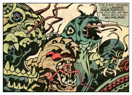
(Art by Jack Kirby)

Monday, October 30, 2006

Two of the best


Today, I 'm recommending to your attention the work of two stellar draughtsmen, Jerry Ordway and Sean Phillips. What's to be gotten from these guys? A whole lot, but I want to concentrate on three aspects.

1. Check out Jerry Ordways' masterful handling of folds. With decades of experience, he has a great grasp of

  • the physical, shadow-casting thickness of folds--in accordance with the thickness of the fabric,
  • the direction of folds in relation to stress points, and of
  • the effect of gravity on clothes. Observe how the lines of the pants are increasingly busy and horizontal as gravity pulls them down onto the tops of the shoes.

Jerry was kind enough to grant me permission to show you guys these gorgeous pencils for his DC project Red Menace.


2. I'm adding a new blog link today. It's that of the very talented Sean Phillips, who is my favorite example of an artist who makes great use of photos without making the art look stiff or traced. His inking is rich and spontaneous-looking, and he doesn't seem to let the facts of the photos push him around. He never forgets he's making comics, that his fidelity is to making the stuff read, not to recreating the photo.

Just as a skilled inker can make a pen line look like a brush line and vice versa, Phillips can often leave me in doubt as to which panels he shot ref for, because he lets the photos inform his approach to drawing. He absorbs the feel of them. This stuff from the book Criminal is his best yet, for my money.

Check it out! http://www.surebeatsworking.blogspot.com

3. Note the fantastically skilled use of shadow on the Criminal pages in particular. He adds much depth solidity and a heavy mood to his panels with black. I like the dry-brush edge to some of the black areas.

JH

Wednesday, September 27, 2006

Work that shop!


(apropos of nothing, the wonderful art of Denis Bodart)

This was an interesting surprise. I didn't really know how to teach a workshop so I just taught in my normal way, and people were surprised that it was, for all intents and purposes, a class. I was surprised because most of them weren't in comics classes.

Since most weren't in comics courses, this was just an enhancement to their Academy experience, and I ended up covering stuff that you guys largely know well:


Comic Book Production,
Marvel style vs. full script
Head and Hands (just various points to remember, goofs to avoid),
Finding the horizon in relation to characters,
Basic rules of perspective
Some common perspective errors,
Using side of pencil, blue pencil, stiff wrist to lay out,
Line of action,
Contrapposto,
Uses/benefits of spotting blacks,
Spotting blacks by keeping it simple, consistent, vis-a-vis light source,
Avoiding "Twins, "
My "Three Masters" shtick (the need to simultaneously serve gesture, volume and shape in figure drawing).
Drawing "Through"

All in one free three-hour session! Such a deal! Next week is an inking lab, probably with some more on perspective thrown in. I can't imagine everybody not benefitting from this. After two more weeks, the Wonderful Mr. Dan Cooney steps in for three weeks.

Try to come next time! Maybe I'll even get it together enough to warn you in time.

JH

Thursday, September 21, 2006

Photoshop basics

Photobucket - Video and Image Hosting
Today's illo is a demonstration of 3-point perspective I made in Adobe ImageReady out of an ad from a travel flyer. Dig that implied zenith, everyone!

Here's where I provide you all the basics for turning your scanned art into a beautiful Photoshop-colored comics page. The text file linked to below will help you decide whether to work in big, bulky layers or sleek, time-saving (but more complicated) channels. This document also discusses how to choose whether to work in RGB or the larger, slower CMYK. It has all the basic steps for setting up and finishing a comics page in Photoshop. And as I mentioned, you can always call me with questions at 362-5633; I love thinking and talking about Photoshop.

Download Bink's Photoshop Primer (pronounced "primmer," BTW) You will probably need to copy this into a new text doctument so the lines wrap.

For our Photoshop lab day, you will need to work with one of these two files, linked below, or bring in one of your own that follows their example. So either way, you'll need to download at least one. They are meant to show the difference in setup between the two methods. If you want to keep things more simple and intuitive, use the second. If you've got a solid grounding in Photoshop and want to color like a pro, use the first. BTW, I would never recommend working in layers and CMYK, because that would be the biggest, slowest-saving file possible. So my specimen CMYK file is in channels, leaving layers for RGB, though one could just as well do RGB in channels too. Confused yet?

Download Bink's CMYK-channels sample Photoshop file
Stuffit of same (quicker download)

Download Bink's RGB-layers sample Photoshop file
Stuffit of same (quicker download)

I will also have these ready for download in the computer lab on our Photoshop day, projected for 5 December. But to get the maximum learning (and grade) from Photoshop day, you would be well advised to download them well before then. That way you can either finish flatting one of these, i.e., replacing the random placeholder colors with your choice of colors, OR following the example of one of these files to set up a file with a scan of your own choosing, ideally your own work.

The text file linked above explains how to finish the flatting process. I'd like to devote the lab time to the second step, modeling aka rendering, aka painting, rather than mere flatting, which is monkey work.

We're confirmed by Dax for a clothed figure drawing day, 17 October. Model will be Frank, who's good.

See you Tuesday,

JH

Tuesday, September 19, 2006

The Big Look Back


Thanks, you guys, for another thoroughly enjoyable class--during which we managed to cover or review a lot of ideas that can make our pages better.
Here they are again, a little better organized than on the handout:


Reviewing key concepts

  • "Drawing Through"
  • "Even if you can't see it, it still shows"
  • Contrapposto
  • Canon of proportions (7-head, 8-head)
  • Line of action--I FORGOT TO COVER THIS ONE. DO YOU KNOW IT? This Tarzan figure by Kubert is a lovely example of how line of action can apply to a figure not in motion
  • Helical perspective/atmospheric perspective
  • 2-point perspective
  • 3-point perspective always involves either the...
  • zenith or the..
  • nadir
  • Establishing shot
  • Close-up
  • Extreme close-up
  • Medium shot
  • 180 rule
  • prop continuity
  • "Variety and Unity"
  • "Breathing room"
  • Eye-path
  • Shape schemes
  • FG-MG-BG
  • Balance: black=weight
  • Dynamism
  • Storytelling


Pro Art for Inking Practice:
In the next couple weeks, I'll be posting jpegs and .psd's of professional penciled pages for you to print out on bristol board. They will print out in non-photo blue. You can use them for fun, practice, or pro inking samples.


JH

P.S.:
Here is a link to some really good portfolio pages. The faces are mediocre and there's one-point perspective in the first panel where where there should be two-, but otherwise I think these are stunning, A-level work, much better than the Vampirella entries.

http://www.drawingboard.org/viewtopic.php?t=46939

Sunday, September 17, 2006

Vampirella contest

Photobucket - Video and Image Hosting
It's all over but the groaning now, but Harris Comics just ran a talent competition. They furnished a 6-page Vampi script; contestants did their best rendition of same. This young woman made the final five.

http://www.drawingboard.org/viewtopic.php?t=47905

I don't know how long she took to do it. It looks like she spent her time well. The work is detailed and very finished. But there are some major drawing problems. What do you think? What grade would you give it?

(You may need to register with the board to see the art; it's easy, free and well worth it.)

JH