Sunday, October 21, 2012

Hello Again, Bitchula!


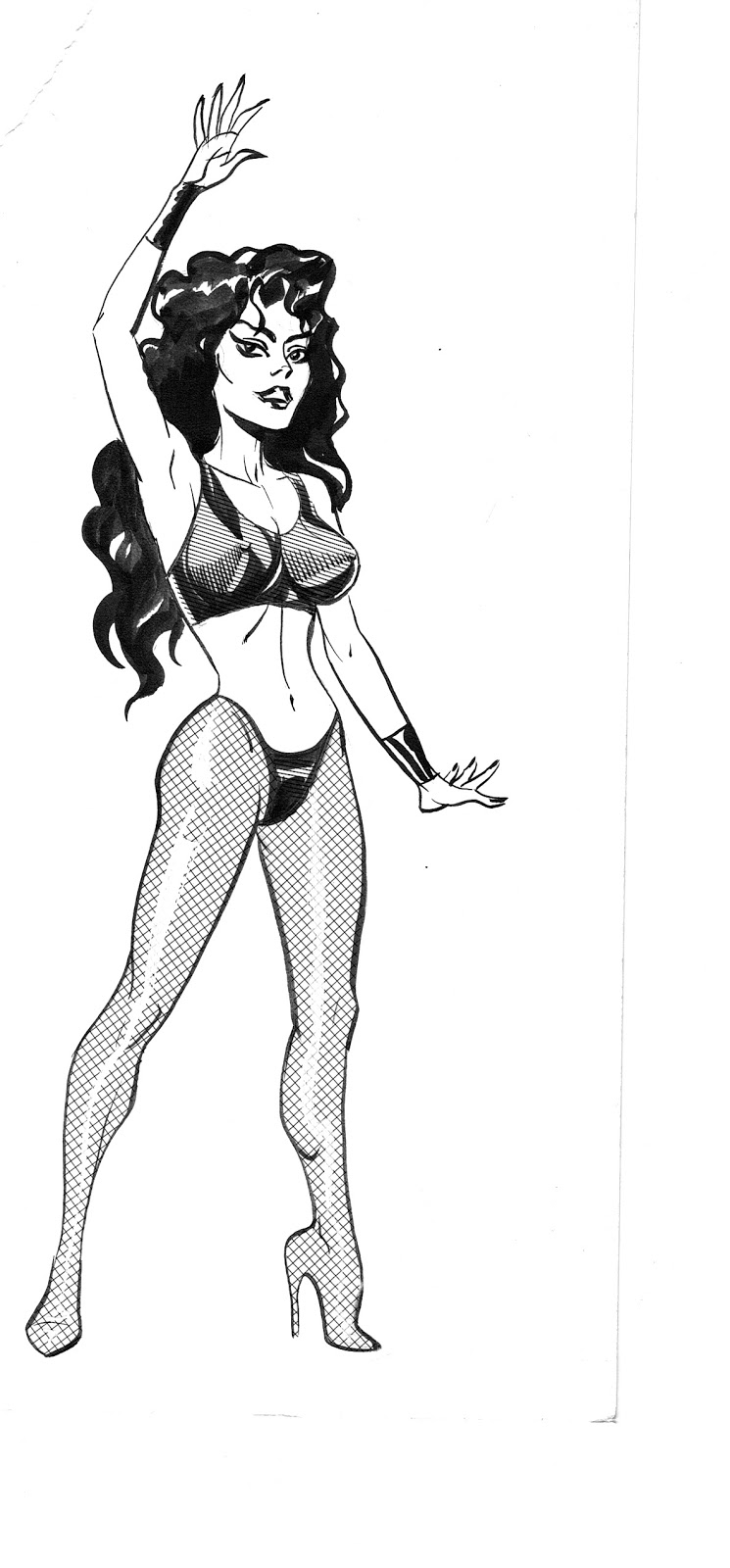
I am going through old artwork and papers, trying to figure out what to do with it all. I came across this c.'97 drawing of my character Bitchula, drawn with more realistic proportions than usual. I like it! Especially the inking. Hope you will too.
JH

Saturday, September 29, 2012

What Do Editors Do, Anyway?

Mainly editors work at getting stories assigned and done on time. Often they say encouraging things to members of their creative teams, especially when one is terribly green. Sometimes they request changes.

My first two regular gigs at Marvel, now long ago, were with editor Mike Rockwitz. He gave me some of that early encouragement, telling me I was getting better every month. More generous than accurate, but very good for me to hear at that point.

Like, I think,  most comic book artists, I experienced few instances of actually being directed to change my work over the years, and only one that originated with Mike. He was doing what any artist would want an editor to do: He kept me from looking like a idiot. Which I will now undo.

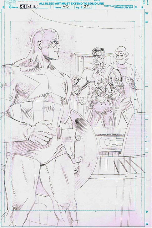
Here's the cliffhanger splash I drew to end one issue, a couple months into my run on Nick Fury Agent of SHIELD. This scene was written by SHIELD scribe Greg Wright to be a surprisingly tense confrontation between Fury and Captain America. I don't need to tell you the reasons Mike had me redraw it, do I? You do have to give me some credit for managing to be both stiff and limp at the same time. Not many could.

(This wince-inducing and once blissfully forgotten fragment of my artistic history came sailing back to me from Marvel Art Returns just a year or so ago, two decades after the fact.)

So how did I redraw it? A lot better, with an uncredited assist from the Law of Averages. It was further enhanced by the excellent inking of Don Hudson.

Thought you might enjoy this little behind-the-scenes.

Thanks, Mike. And Greg, for the many times you steered me away from terminal dullness on SHIELD. Or tried to!

JH
P.S.: Also recovered, an equally weak 2nd try, which
I can't even bring myself to scan!

Thursday, September 13, 2012

Siri Series

What Japanese cartoonists visualize when their iPhones talk to them. There's an incredibly wide range of abilities (and degrees of misogyny) here, but since it's Japanese, we can all be comforted by the lack of distinct individual styles. Sigh...
Siri sounds like the word for butt in Japanese, which partially explains some of these.
JH

Thursday, September 06, 2012

Two VERY different Offerings

Courtesy of my good pal Ronn Sutton, an unmissable link for Kubert fans that reminds how close examination of Kubert's work, appreciative or analytical, is an encounter with the depth and breadth of his ability. I can only think of a handful of other artists whose every line was infused with such emotionality--and none other who balanced that with such formal and storytelling smarts and deep drawing knowledge.

I wouldn't be shocked if this link didn't stay up so, git ta downloadin', chillun!


Second, from the worthy comics newsite bleedingcool, a trailer for a digital comic that heralds the coming of a new open-source digital comics platform, supposedly, but comes off like middle-aged Limp Bizkit paired with an advertising storyboard, rather than a comic. (I've never heard of the similarly titled work that this one is inspired by.)

I give you former Marvel President Bill Jemas, and his new opus, "Get the F#ck Up"
Watch it with someone you love.
JH

Friday, August 24, 2012

POD People

Thanks to AAU grad Sara Wooley, here is an interesting article on Print-on-Demand publishing.
I'm not enough acquainted with the economics to judge the articles' credibility, but the fact that it's Publisher's Weekly says a lot for it.

JH

Tuesday, July 31, 2012

Comics and Comics

Patton Oswalt, who--along with Dana Gould--is my favorite standup comic, delivered the following barn-burner of a speech at the beginning of the recent Montreal Just For Laughs comedy festival. It's meant for standup comics and people in the comedy business, but I think it can apply to us. Quoting Doug Stanhope's tweet:

Comics - Please re-post over and over in every optimum time zone. For days and weeks and years.

We have an analogous situation in comics (that is, ugh, "sequential art narrative," or what-have-you). The gatekeepers (publishers) are much less important, or should be. We haven't had, that I'm aware of, a DIY breakthrough like Louis C.K.'s self-produced hit comedy CD and DVD "Hilarious." Entirely possible with commonly available technology, though. It's coming...

JH

Thursday, May 31, 2012

Here a talented fellow from the other side of the globe lays down some principles of character design in a way that's clear, practical and inspiring. Ladies and gents, Tim Gibson.

Not only will such choices make your characters different from each other (which may up their chances of feeling real and human), it will help you keep the characters internally consistent, something I struggle with, or should.

Maybe it goes without saying, but this is not just for animation and video game design...

JH

Wednesday, March 07, 2012

These Panels Will Come to Order!

I like for students, when breaking down pages into panels, to make the reading order unambiguous.

But here's an case of a dangerous panel division actually being pulled off, I think. See if you agree.

In theory, when the reader finishes panel 3, he has two competing choices of which panel to read next: the one to the right, or the one below. Just the sort of momentary confusion that can be easily avoided and should be.

Except here I think the artist (a young Alex Kotzky, perhaps) has already finessed the situation. He has used a stack of three panels of equal width to make it fairly clear that readers are to read down. There's no balloon in the upper part of the tall panel to the right to lure our eye away. Indeed the upper part has almost nothing to draw our eye away--not the way a face or figure might.

It works, or so say I. Even the identical treatment of the captions atop panels 3 and 4 whispers gently, "read down."

JH

Friday, February 17, 2012

OK, This Is Interesting!

A firm called Graphicly aims to smooth the way for digital comics self-publisher. You won't believe how low the cost is currently.

I, and most everybody at ye olde Acad, thinks that soon the primary means for first contact between readers and a new comic has to be digital, and that a revolution is coming in the business, with technology lowering prices and printed comics being mainly limited to collections of established hits.

Graphicly might be the outfit to facilitate this change.

JH

Saturday, July 09, 2011

Manga Machine

Look what I'm saying I found in an old magazine! Wow! Interesting. If I lived back then and needed to draw a pie-eyed, soulless kewpie doll, the answer would have been a little machine! Hella crazy.

JH

P.S.:  ;D Just kidding, mangaphiliacs. I love ya. You know that!

Monday, July 04, 2011

Sharing the "Wealth"


Here are some materials I did up for one of my directed study students today. She is someone who is already unusually aware of the little offsets and foreshortenings that make a face work in 3/4 view. The points made in these jpegs were offered as refinements upon that foundation.

I insist that paying attention to this stuff, which is all based on life, can add charm and convincingness TO A VERY WIDE RANGE OF STYLES.

Longtime friends and students may notice that one of these continues my almost-unhealthy preoccupation with eyebrows as indicators of dimensionality or, conversely, unsophisticated drawing.

(I am all about the sophistication, as you can tell by this grotesque kid in particular.)


JH
These are Copyright 2011 Academy of Art.


Sunday, June 19, 2011

A Mere Three Months Later...

I finally sucked it up and finished this pinup for Chris Mill's Gravedigger book, which, luckily for me, ran late. I am the unproud possessor of a sheaf of papers bearing flat, fruitless, dead-end doodles on the way to this. All things considered, I think it came out fairly well. I like that the cluster of centers of interest are placed assymetrically for one thing. Chris says he'll let me know when the book is out, which I guess is his way of saying that I won't be getting a free copy. Sigh... Times is hard in the comics biz.
 JH

JH

Monday, May 23, 2011

After Surgery

My cancer surgery of last week went well. The surgeon, Mark Singer, is a preeminent, highly skilled guy who also is very good-humored and reassuring--not that common a combination, I'm told and I believe it.

It's a good thing this is basically happening between  semesters. I look scary now and my voice is shot. But the body, even the post-middle-age body, is an incredible thing.

I want to thank everybody who shook my hand or sent me an encouraging message through email or Facebook.  There's never any need to feel called upon to say something special in such a case; I can tell you every expression of good wishes is gratefully banked and adds to the strength I can bring to bear in the situation.

(But when a friend quoted a line from an old Simpsons episode to me, "Chicks dig scars," that was kind of extra bonus special. :)  )


JH

Friday, May 13, 2011

To Inspire... or Repulse

This is Rob Liefeld's work, the sample that got him his first job at a major publisher. Is it awful? Well it ain't great, but it's neatly drawn, highly inkable, and has a certain grand quality to its figures, and distinctive rendering style. The background, eh...not so convincing, but the strong use of diagonals adds a lot of energy to the composition. The hands and feet are bad.

What does this illustrate?

Maybe "right place, right time," but more than that: in comics, making work that's confident and professional on its own unique terms can be a powerful thing. Everybody says this guy is bad because everybody says he's bad, but how many of us could for sure do something that more people would respond to? Not that is the only measure. But it ain't nothing.

Good luck in your final push, you-all.

JH


Tuesday, May 10, 2011

Comics' Future.

An interesting article that raises some important question about the way that the Big Two might react to the increasing obsolescence of the printed monthly comic. Thanks to P. Hari of LinkedIn's comics group.
http://socialwizz.com/?p=4289
The surpassing sagacity and foresightedness of the comments that follow it are due their being written by me. :)
JH

By Request--Fisheye aids!


Here are those "globe grids" for five point and four point fisheye. Rememeber that four-point is the more complex of the two, as it involves what are essentially three partial globe grids staggered across each other.
These are from Creative Layout, by Joko et al. 

JH

Friday, April 08, 2011

ILLUSTRATION CONTEST!

Chuck Pyle sent this one along. Could be a nice opportunity...
LINK

JH

Wednesday, March 16, 2011

"New Very Awesome" Comics Job

So, so impressive when people who post a job listing can't write and proofread. But contrary to the prevailing pattern, this guy says he's paying:


Posted Date: 3/15/2011  
Major:   Illustration
Title:      SUPER HERO COMIC ARTIST NEEDED
Key Skills: Penciling, Inking, Painting, Lettering

Job Description:
New very awesome esoteric group of projects that has lots of potential
and has financial backing.
Looking for artist with the same likes as Todd McFarlane and Dale
Keown (Spawn, The Darkness/Pitt). Love their attention to detail and
style.
Looking to create 3-6 issues of a new type of comic character. Very
very niche but huge potential concept. IMAGE comics connections for
publishing and production. Email for NDA and more info along with your
resume, references if possible and examples of work
Project will start with you as indie contractor and move to fulltime.

Job Qualifications:
-CREATIVE & INVENTIVE. 
-We want someone who is daring with imagery and wants to be cutting
edge in the next style and concepts.
-Love comics and have a passion for comics.
-Good at taking ideas and branching off the original but staying true
to the aesthetic.
-Able to be HIGHY PRIVATE AND DISCREET.
-Prompt
-Ahead of schedule
-Laugh at pressure and due dates.
-Discipline and committed

Pay is based per page as is for any comic book artist.

Pay Range:  Negotiable
How To Apply:
Email Resume, Company Website


Location of Job:      San Diego (but work from home is possible)
Length of Position:      TBD
Contact Information:
Company Name:    TYME 2 SHYNE ARTISTIC STUDIOS LLC.
Address:        3515 Morena Blvd.
              San Diego, CA 92117

Contact Name:    Gerald Venditti
Contact Phone:   Contact me (JH) for phone number
Fax Number:     
Email Address: 
Website:        http://www.t2sartisticstudios.com
Company Profile:
A new company looking to create a team of extraordinary artistic
individuals in the entertainment industry.

More information available upon request and with a signed and initialed
Non-Disclosure Agreement.

Cashing the Check of Fisheye

The first photo shows a realtor's use of a wide angle lens, perhaps in a vain effort to make a tiny bathroom appear bigger. Note the slight curving of straight lines near the edges of the photo. Fisheye in action, in a very minor way. Note also the distortion of the squares of the tile floor at the bottom, similar to what we get if we extend a grid too close to the viewer and pass the Station Point.

The second photo shows another example of slight fish-eye-ness in a normal wide-angle picture. Look at the curving of the line above the store name.
 Next, an audacious and impressive use of a slight upshot in a fisheye context. The dropped horizon sags justly. Though much informed by fisheye photography, this is a intuitive, freehand approach to perspective, not a technically correct one--but no worse for it. Quite the opposite. I think it's terrific.

Here's a rough for a work-in-progress on a women-in-prison project I'm calling "Women in Prison." It's a WIP WIP. OK not really--it's just a doodle I did for the blog to show the use of fisheye in an indoor setting, and to remind young women of the perils of suburban piracy.

Note that in fisheye all the perspective is forced, comic-book style. That means that apparent scale differences, like between foreground and deeper objects, such the ladies' heads, are maximized. Note as well that our view of the standing woman goes from a decisive down-view of her feet, to a unequivocal upshot of her head. Objects in fisheye are closer than they appear.

(The green projection lines running back to the DVP--not shown--bow outward, away from the center of vision, and that has the effect, I believe, of accelerating the diminution of the floor tiles.)

Here finally below, as promised, the "globe grid" used to make five-point fisheye drawings, presented both singly and in a form for doing multi thumbnails. The center point is a VP and there are VPs at 12, 3, 6, and 9.  I am not posting the globe grid for the maddeningly complex four-point perspective (Yes, four-point is more complicated than 5- , oddly.) although I will if you ask me purty-like.
JH