Saturday, November 25, 2006

One "Minx," un-saucy

Photobucket - Video and Image HostingDuring the energy crisis of the 1970s, Toyota was suddenly kicking ass here in the US. GM was blindsided by consumers' sudden desire for smaller cars. Unable to instantly retool, GM tried to spin itself as the small car expert--which claims rang hollow, as most of their lines comprised two-ton metal slabs.

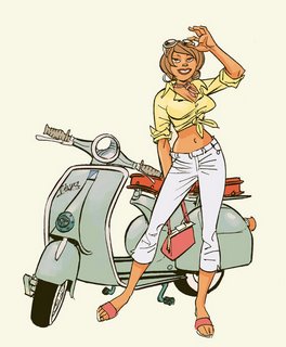
DC Comics, having noticed that girls are flooding bookstores to read manga, has now moved to better exploit that new market--even more nimbly than a capital-intensive, risk-averse Rust-Belt conglomerate like GM.

For years, people in mainstream comics pulled their hair trying to figure out how to bring young women into the comics market. Given that most comic book stores then (much as now) were the personal feifdoms of socially stunted male nerds, the outlines of the marketing challenge were as expansive and unmistakable as those of the bloated razor-phobic cranks behind the cash registers. Everybody in the business knew girls were capable of enjoying comic books, and not just because they had in the past. And everybody knew girls wanted comics about people in relation to people, rather than weapons, costumes, powers, things. The chicks are koo-koo that way.

And DC came closer to cracking the code, early on, than other publishers, with their Vertigo line--specifically with their Neil Gaiman--luring in bright, artsy, self-consciously alternative readers of both sexes.

But for some reason it took the largely inexplicable (to me) allure of the cookie-cutterish Japanese approach to comics to lure in massive numbers of young female readers. Surely the sunny, standardized sexlessness of the art helped. And to the surprise of probably no one but me, it happened in big bookstores.

Take a few minutes, if you would, to read this article about how DC is planning to get in on the action. See what you think of first comic of their new Minx line, unwinningly entitled Plain J.A.N.E.s., like some lame spy spoof in a second-tier porno rag. Me, I think it looks like a non-artist's attempt to emulate Dan Clowes, with pacing that would make me lose interest in about six pages, were I still a wee teen. Should it really take one whole page to set up a commonplace situation, exchange three tiny balloons' worth of dialog and muddle through a couple largely indecipherable expressions?

New York Times article on DC's Minx line

Thanks to Chuck for the link.

See you Tuesday. Bring your inking kits again!

JH
Wednesday, November 08, 2006

We're famous!


The folks at Newsweek lovingly created this slick little slideshow giving an overview of comics--much of it shot from the original art. Thanks to Chuck for this.

Newsweek slideshow


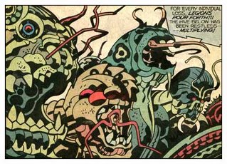
(Art by Jack Kirby)

Monday, October 30, 2006

Two of the best


Today, I 'm recommending to your attention the work of two stellar draughtsmen, Jerry Ordway and Sean Phillips. What's to be gotten from these guys? A whole lot, but I want to concentrate on three aspects.

1. Check out Jerry Ordways' masterful handling of folds. With decades of experience, he has a great grasp of

  • the physical, shadow-casting thickness of folds--in accordance with the thickness of the fabric,
  • the direction of folds in relation to stress points, and of
  • the effect of gravity on clothes. Observe how the lines of the pants are increasingly busy and horizontal as gravity pulls them down onto the tops of the shoes.

Jerry was kind enough to grant me permission to show you guys these gorgeous pencils for his DC project Red Menace.


2. I'm adding a new blog link today. It's that of the very talented Sean Phillips, who is my favorite example of an artist who makes great use of photos without making the art look stiff or traced. His inking is rich and spontaneous-looking, and he doesn't seem to let the facts of the photos push him around. He never forgets he's making comics, that his fidelity is to making the stuff read, not to recreating the photo.

Just as a skilled inker can make a pen line look like a brush line and vice versa, Phillips can often leave me in doubt as to which panels he shot ref for, because he lets the photos inform his approach to drawing. He absorbs the feel of them. This stuff from the book Criminal is his best yet, for my money.

Check it out! http://www.surebeatsworking.blogspot.com

3. Note the fantastically skilled use of shadow on the Criminal pages in particular. He adds much depth solidity and a heavy mood to his panels with black. I like the dry-brush edge to some of the black areas.

JH

Wednesday, September 27, 2006

Work that shop!


(apropos of nothing, the wonderful art of Denis Bodart)

This was an interesting surprise. I didn't really know how to teach a workshop so I just taught in my normal way, and people were surprised that it was, for all intents and purposes, a class. I was surprised because most of them weren't in comics classes.

Since most weren't in comics courses, this was just an enhancement to their Academy experience, and I ended up covering stuff that you guys largely know well:


Comic Book Production,
Marvel style vs. full script
Head and Hands (just various points to remember, goofs to avoid),
Finding the horizon in relation to characters,
Basic rules of perspective
Some common perspective errors,
Using side of pencil, blue pencil, stiff wrist to lay out,
Line of action,
Contrapposto,
Uses/benefits of spotting blacks,
Spotting blacks by keeping it simple, consistent, vis-a-vis light source,
Avoiding "Twins, "
My "Three Masters" shtick (the need to simultaneously serve gesture, volume and shape in figure drawing).
Drawing "Through"

All in one free three-hour session! Such a deal! Next week is an inking lab, probably with some more on perspective thrown in. I can't imagine everybody not benefitting from this. After two more weeks, the Wonderful Mr. Dan Cooney steps in for three weeks.

Try to come next time! Maybe I'll even get it together enough to warn you in time.

JH

Thursday, September 21, 2006

Photoshop basics

Photobucket - Video and Image Hosting
Today's illo is a demonstration of 3-point perspective I made in Adobe ImageReady out of an ad from a travel flyer. Dig that implied zenith, everyone!

Here's where I provide you all the basics for turning your scanned art into a beautiful Photoshop-colored comics page. The text file linked to below will help you decide whether to work in big, bulky layers or sleek, time-saving (but more complicated) channels. This document also discusses how to choose whether to work in RGB or the larger, slower CMYK. It has all the basic steps for setting up and finishing a comics page in Photoshop. And as I mentioned, you can always call me with questions at 362-5633; I love thinking and talking about Photoshop.

Download Bink's Photoshop Primer (pronounced "primmer," BTW) You will probably need to copy this into a new text doctument so the lines wrap.

For our Photoshop lab day, you will need to work with one of these two files, linked below, or bring in one of your own that follows their example. So either way, you'll need to download at least one. They are meant to show the difference in setup between the two methods. If you want to keep things more simple and intuitive, use the second. If you've got a solid grounding in Photoshop and want to color like a pro, use the first. BTW, I would never recommend working in layers and CMYK, because that would be the biggest, slowest-saving file possible. So my specimen CMYK file is in channels, leaving layers for RGB, though one could just as well do RGB in channels too. Confused yet?

Download Bink's CMYK-channels sample Photoshop file
Stuffit of same (quicker download)

Download Bink's RGB-layers sample Photoshop file
Stuffit of same (quicker download)

I will also have these ready for download in the computer lab on our Photoshop day, projected for 5 December. But to get the maximum learning (and grade) from Photoshop day, you would be well advised to download them well before then. That way you can either finish flatting one of these, i.e., replacing the random placeholder colors with your choice of colors, OR following the example of one of these files to set up a file with a scan of your own choosing, ideally your own work.

The text file linked above explains how to finish the flatting process. I'd like to devote the lab time to the second step, modeling aka rendering, aka painting, rather than mere flatting, which is monkey work.

We're confirmed by Dax for a clothed figure drawing day, 17 October. Model will be Frank, who's good.

See you Tuesday,

JH

Tuesday, September 19, 2006

The Big Look Back


Thanks, you guys, for another thoroughly enjoyable class--during which we managed to cover or review a lot of ideas that can make our pages better.
Here they are again, a little better organized than on the handout:


Reviewing key concepts

  • "Drawing Through"
  • "Even if you can't see it, it still shows"
  • Contrapposto
  • Canon of proportions (7-head, 8-head)
  • Line of action--I FORGOT TO COVER THIS ONE. DO YOU KNOW IT? This Tarzan figure by Kubert is a lovely example of how line of action can apply to a figure not in motion
  • Helical perspective/atmospheric perspective
  • 2-point perspective
  • 3-point perspective always involves either the...
  • zenith or the..
  • nadir
  • Establishing shot
  • Close-up
  • Extreme close-up
  • Medium shot
  • 180 rule
  • prop continuity
  • "Variety and Unity"
  • "Breathing room"
  • Eye-path
  • Shape schemes
  • FG-MG-BG
  • Balance: black=weight
  • Dynamism
  • Storytelling


Pro Art for Inking Practice:
In the next couple weeks, I'll be posting jpegs and .psd's of professional penciled pages for you to print out on bristol board. They will print out in non-photo blue. You can use them for fun, practice, or pro inking samples.


JH

P.S.:
Here is a link to some really good portfolio pages. The faces are mediocre and there's one-point perspective in the first panel where where there should be two-, but otherwise I think these are stunning, A-level work, much better than the Vampirella entries.

http://www.drawingboard.org/viewtopic.php?t=46939

Sunday, September 17, 2006

Vampirella contest

Photobucket - Video and Image Hosting
It's all over but the groaning now, but Harris Comics just ran a talent competition. They furnished a 6-page Vampi script; contestants did their best rendition of same. This young woman made the final five.

http://www.drawingboard.org/viewtopic.php?t=47905

I don't know how long she took to do it. It looks like she spent her time well. The work is detailed and very finished. But there are some major drawing problems. What do you think? What grade would you give it?

(You may need to register with the board to see the art; it's easy, free and well worth it.)

JH

Saturday, September 16, 2006

The singer AND the song


(Page by Alary)

Nice quote a friend sent me, from an artist who goes by "Moma":

"I was at a party last year and a little girl drew a picture of all the guests round the table except me. I pretended to be offended and drew myself into her picture, but she ran away screaming and bawling. I had to erase my self-portrait before she'd calm down. That says it all. Our little pictures and our little songs are more important to us than the life they occasionally portray. The world in the end is beyond our control and doesn't care about us. But in our pictures we have the illusion of making sense of the world, improving the world, taking control of it. And suddenly it's no longer either the world or our vision of it, it's a new world, a thing in itself. The drawing comes to mean more to us than the scene it depicts."


JH

Friday, September 15, 2006

It Blogs!


Hey, you lucky few.

There's a riddle that runs, "What does a redneck say before he injures himself?" "Watch this!" I may lack the drunken self-confidence to say "Watch this!", but I think the worst thing that could happen here is my appearing foolish as I try to catch up to 2002. Which is not too bad. This blog might be helpful despite my technolaggardry.

Here's a link to the original post, for Week1-2, which was done as a conventional website. Here you'll savor the standard first-week policy boilerplate, irresistably teamed with the materials list, and so on, as well as links to online art suppliers and some great examples of page layouts.
http://www.heebink.com/ILL193

And here is the finalized schedule for the rest of the semester. I hope it's demanding enough to keep you warmed-up and busy and to avoid overthinking, but lax enough to actually be doable. It starts with our third meeting.

REVISED SYLLABUS/schedule
Meeting 3 (Tuesday26Sep) Review "Vegas" breakdowns. Assignment: thumbnail and lay out first 4 layouts. Tight!--With indications of backgrounds and perspective.

Meeting 4 (Tuesday03October) Review layouts in relation to variety, unity, eye-path, diagonals, breathing room, shape schemes, depth, storytelling, perspective. Assignment: final four thumbnails and layouts, changes to first four.

Meeting 5 (Tuesday10Oct) Review last four page layouts. Troubleshoot as necessary. Discuss perspective, working method, materials. Assign changes to last four layouts, and first page of pencils.

Meeting 6 (Tuesday17Oct) Review first penciled page. Benchmark: All layouts done. Discuss use of black, line weight. Assign next two pages of pencils, changes to p.1. FIGURE DRAWING DAY

Meeting 7 (Tuesday24Oct) Review pp. 2,3, revised p. 1. Assign pp. 4 of pencils, changes to pp.2,3, study for midterm quiz. GUEST SPEAKER DAY?

Meeting 8 (Tuesday31Oct) Midterm Quiz. Review first 4 pages of pencils. Assign next two pages of pencils Through p.6), changes to p.4.

Meeting 9 (Tuesday7Nov) Review of next two pages of pencils (through p. 6). Assign final two pages of pencils. Make 100% Xeroxes of all pencils for inclusion in final pitch packet!!

Meeting 10 (Tuesday14Nov) Final Review of pencils. John to collect, scan pencils. Assign penciling of character sketches, three cover layouts. Catch up for coming benchmark. Reminder to bring inking kit to next class.

Meeting 11 (Tuesday21Nov) Return of pencils. Review of character sketches, cover layouts. final tweaks on pencils in class! Then INKING LAB 1. In-class inking exercises. Assign cover pencils, optional inking of character sketches. Happy Thanksgiving!

Meeting 12 (Tuesday28Nov) Benchmark: all corrections to pencils finished! Review of cover pencils. INKING LAB 2. In-class assignment: inking of provided panels. Assign three pages of inking, plus (optional) getting one's own files ready for upcoming Photoshop lab.

Meeting 13 (Tuesday5Dec) Review of first three pages of inking. Assign next three pages inking, (through page 6), PHOTOSHOP LAB DAY

Meeting 14 (Tuesday12Dec) Review of next three pages of inking (through p.6). Assign last two pages of inking, plus cover inks. Reminder to touch up smears, erase margins, etc.

Meeting 15 (Tuesday 19 Dec) Presentation of Final projects. Turn in Xeroxes of same, including copies of pencils, to John. ALL-POSITIVE COMMENTS DAY. Discussion of approaching publishers, professional conduct, further schooling, written part of pitches. GUEST REVIEWER Chuck Pyle

See you Tuesday!
JH